UIUX Designer
Part I: UIUX Projects
1. Green Haus

2. I-Books


Design Process
Empathize with users – Define the problem – Ideate solutions – Prototyping – Testing
Empathize with users
To fully understand the needs and pain points of users, I had to conduct user interviews. This way, I get to understand what they really want and if they will be interested in sustainable houses – thereby avoiding any bias. I interviewed 10 adults between the ages of 30 and 60, who want a new house or would like to renovate their old houses.
I also conducted personal research on houses in Nigeria and how Nigerians have been interested in buying houses as this will help me have a view of the housing world.
Competitive Analysis
To further understand the task at hand, I carried out a research on other construction companies. Taking note of their designs, mistakes and focusing on how I could imitate them with a better approach and avoid their mistakes. I checked out their platforms like a prospective user — this helped me pick out the pain points users might have while using these platforms and identify how to create a solution with better experience.
Pain Points
Three (3) major pain points were identified in the research phase which are:
-
Location
-
Price
-
Accessibility to emergency services
Empathy Map
Overview
Problem statement
Blek-scon Construction Colony Ltd – a construction company situated in Nigeria needs a new focal lens where their customers can view and purchase their eco-friendly architectural designs, houses, and apartments. They also aim to incorporate the idea of living a sustainable life.
Solution
I set out to create a new design that connects users, the environment sustainable houses and Blek-scon Construction Colony Ltd without leaving out the usability and aesthetics across all corners of the application.
My Role
I led the project and worked on all aspects of the design framework including the visual, UX, and usability tests. I likewise patched up the UX of key pages while a group of developers helped bring my design to life.

Design Process
Paper Wireframes
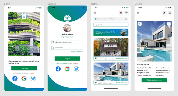
Taking the time out to draft iterations of each screen of the app on paper ensured that the elements that made it to digital wireframes would be appropriate to address user pain points. For the home screen, I prioritized an easy and smooth viewing and searching process to help users perform tasks easily.
NB: More details cannot be revealed because of the Non-Disclosure Agreements I signed with Blek-scon Construction Colony Ltd.

Final Product
Accessibility Considerations
The main goal was to create a design that puts every user in mind irrespective of their age, diversity, location and other factors. I wanted every user to have similar experiences while using the app. To achieve this, I put a few things in mind which are in the image below.
Takeaways
During the process of this task, I learnt that the first ideas for the app are just the beginning of the process and are not always the best. Usability studies influenced each iteration of the app’s designs. I also learned to overcome my own biases and create a product that is useful to everyone. The application puts users and their needs first.
“Love the application interface and design. Seems highly functional and good choice of palette and imagery” – a review from Engr Reuben Kingsley, the CEO of Bleks-con Construction Colony Ltd.
Future Activities
User experience never ends, I would do the following:
-
Conduct another round of usability studies to confirm if all user pain points have been addressed.
-
Conduct more user research to determine any new areas of need for future updates.
Tools I used:
-
Figma
-
Miro
-
Google Docs
-
Google Slides
-
Google Spreadsheet
-
Zoom (For user interviews)


Using the completed set of digital wireframes, I created a low-fidelity prototype.
The final design was refined and improved to suit users’ needs and provide an easy navigation process for users.
Usability Testing For High Fidelity Designs
To understand the usability of the app before the High Fidelity designs, I recruited 10 participants to help test out the low-fidelity prototype.
Watching the participants interact with the app and listening to their thought processes, helped me pinpoint problem areas. Results were taken note of and an affinity map was created to identify patterns. NB: Testing was done remotely.
Another round of usability testing was conducted using the high-fidelity prototype. By testing the design at this stage, I could observe an interaction that most closely resembles a real-life interaction with the final product. NB: Testing was done remotely.
The booking an appointment stage was confusing to most users as it had a long process to go through before successfully confirming an appointment. After the usability test, I simplified the experience for users.
Overview
Problem Statement
Books will remain one of the sources and mediums of knowledge for the next generations. According to UNESCO, 'Pupils in the poorest countries are suffering from the lack of basic textbooks to learn.', i-books, a project under Kodecamp was allocated to me. I was assigned to create a solution to how people can donate their used books to schools, pupils and strangers.
Solution
To provide a solution to this problem, I had to design a research plan, enrol participants for research questionnaires and design a user-friendly book donation mobile application.
My Role
I worked on all the phases of this project. Usability tests, visual designs, user research and design were done by me.
Design Process
Empathize with users – Define the problem – Ideate solutions – Prototyping – Testing
Empathize with users
The user experience was my main focus during this course of this project. I conducted user interviews. 30 participants were enrolled for the purpose of good user research. The participant's ages range from 20 to 70 years. A questionnaire of 15 questions was rolled out and results were gathered using google analytics.
Competitive Analysis
Due to the nature of the problem, there was no current book donation application in Nigeria at the time this project was on. This was a difficult phase for me as I had to use competitors from other continents like Europe and Asia.
Pain Points
Three (3) major pain points were identified in the research phase which are:
-
Time
-
Privacy
-
Overwhelmed with information
Empathy Map
HI-FI Wireframes
After collating a successful usability test result from the low-fidelity design, I moved to the next phase of making a high-fidelity design. The high fidelity was designed with a little adjustment from the low fidelity design. The hi-fi was designed to make an easy user flow towards the main goal and to ensure the best experience for users.
Usability Testing For High Fidelity Designs
To ensure that I have actually provided a solution to the problem I was solving, I recruited 10 participants to help test out both the low-fidelity prototype and high-fidelity prototype. I observed as the participants interacted with the app, they helped me pinpoint areas that needed adjustment and corrections. Results were taken note of and an affinity map was created to identify patterns. NB: Testing was done remotely.
The usability test was done four different times and the final result shows the level of success in the project.
Final Product
Accessibility Considerations
My main focus is to fix a route between users and organizations that help in donations. I created an application whose main responsibility is to give the perfect user experience while using it.
Takeaways
I overcame lots of personal bias during the stages involved in this project. I had to redesign twice because I couldn't get the user experience I wanted. I now understand why user experience should be the primary aim of a product designer. The application puts users and their needs first.
Future Activities
User experience never ends, I would do the following:
-
Conduct another round of usability studies to confirm if all user pain points have been addressed.
-
Conduct more user research to determine any new areas of need for future updates.
Tools I used:
-
Figma
-
Miro
-
Google Documents, slides, spreadsheet, form
-
Zoom
3. KampusPadi
Overview
Problem Statement
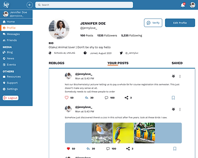
It's everything except surprising that African students really persevere through regret and depression due to the pressure from their lecturers, co-students and parents. According to an article on Europe PMC, 65% of tertiary students in Nigeria experience depression due to several sociodemographic factors. I was entrusted by a leading body of NGOs (Mental Aware Nigeria Initiative and Stand to rape initiative) to provide an informal community to Nigeria students (Africa) which will function like Instagram or Facebook yet with the obligation of assisting with detailing issues happening within their separate colleges and furthermore also provide an avenue where students will be able to message experts from these NGOs (MANI and SRI) covertly.
Solution
This is a huge task due to the fact that the Nigerian government, unlike Germany, do not guarantee to save data and freedom of speech. I had to think about the best way to approach this problem. I sorted it out with other team members and got lots of advice from them. To ensure that information given during my research are true, I assured my user group on their data will be safe and deleted immediately after the project is completed. I even signed an NDA agreement with them. I also had to study the Nigerian constitution regarding social media and data usage.
My Role
I worked on all the phases of this project. Usability tests, visual designs, user research and design. I had the help of my team members whose contribution was highly appreciated.
Design Process
Empathize with users (Research) - Define the problem - Ideate solutions - Prototyping - Testing
Empathize with users (Research)
The user experience and data protection were my main focus during this course of this project. I directed user interviews. Over 200 students were enrolled. I had to go for a large number due to the population of Nigerian students The participant's ages range from 16 to 35 years as master students were included in the research. A questionnaire of 10 questions was rolled out and results were gathered using google analytics.
Pain Points
I was able to identify various pain points and find solutions to them. I created my user persona, empathy map, Information architecture, and user flow. I proceeded from this point to carry my product owners along as I have some serious issues going on with the task.
Low fidelity wireframes
Just like every user-centred designer, I started introducing my solution by designing a low-fidelity wireframe. Some samples can be found in the image below. Taking my user persona into consideration, I must confess that designing this LO-FI was not easy for my team and me. On several occasions, we had to request the advice of our senior colleagues. We manage through this stage with serval meetings with the NGOs and product managers.
High fidelity wireframe
Having discussed the LO-FI with the NGOs and product owners, my team and me move to the next phase. The usability test was not performed on the LO-FI because of the number of screens that needed to be designed and time wasn't our friend anymore. The HI-Fi and prototyping was my favourite session of the project. I was excited because I was once a Nigerian student and I know the level at which the solution I have created will help future generations. At this stage, I decided to distribute the screens to be designed among each team member. I designed the Onboarding, Home(for both existing and new users), Student profile, change password, chat page, resources, 404 error, verification screen, and news page screens. Other elements designed by me include the logo, icons and style guide.
Usability Test
At this junction, we were running out of time and we needed to meet the scheduled time frame to enable the developers to begin their phase of the project. We had to conduct the services of a usability testing center in Nigeria. This was supervised by the product managers as we only got a beautiful remark after the project was presented to the board of NGOs.
Other minor projects I designed can be found in the following links
NB: These are details needed to access the pages
Username: michaela@pellsea.com
Password: 123456
Part II: Graphic Design Projects
Design Process (User flow)
LO-FI Wireframes
Using the necessary information I gathered from my user research, I started my low fidelity design which was used for the first phase of usability testing. I encountered a lot of difficulties during this phase as users could not reach the design goal during the test so I had to sit back and redesign my low fidelity design before running another usability test.